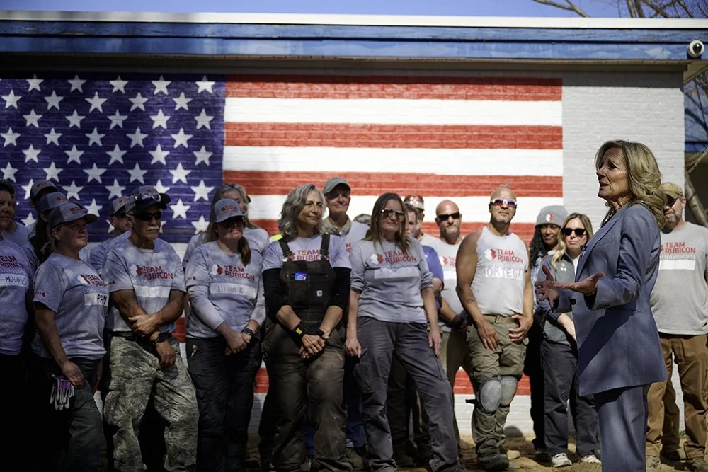
Team
Rubicon
Branding a Movement Built to Serve
Team Rubicon was born from a bold idea: mobilize military veterans to serve communities affected by disaster. From day one, I partnered with the founding team to create a brand that matched the strength, clarity, and urgency of that mission—helping transform a grassroots effort into a nationally recognized force for good.
At the heart of the identity is the name itself, inspired by the ancient Rubicon River—crossing it symbolized a point of no return. This narrative became central to the brand. The bold ‘X’ mark represents decisive action, unity, and service. It’s both a visual shorthand and a rallying symbol—instantly recognizable, deeply meaningful.
The brand system extended across digital, print, apparel, and gear—built to be functional in the field and powerful in storytelling. From the original logo to foundational design elements, every detail was crafted to inspire confidence, communicate purpose, and honor those who serve.
This foundational work not only launched Team Rubicon’s journey but also established a brand that embodies its mission and continues to inspire volunteers, donors, and partners worldwide. It remains a testament to the power of design in amplifying a mission-driven organization's impact.
Year
2010 - ongoing
Client
Team Rubicon
Los Angeles, CA